Population of Virginia 1850 has a great data set that, although not “visual”, was the most meaningful data set regarding Virginia history for classroom.
I examined several internet sites for possible use such as Tableau and Qlik but “data visualization” their way is way beyond me; html is nothing I’m trying to learn. I’m also over creating account after account under “Free Trials”. The number of paid accounts I have for teaching is far too many and I’m not interested in adding any others.
Instead, I opted for a student friendly Create-A-Graph. It was super simple! Much more my style. The power of data visualization is real but sadly it’s not a power of mine. I do use graphs but ones generated y others and ones that display mangable amounts of information. My students never need anything more than what’s below.
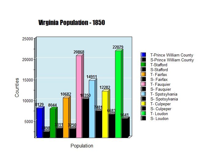
Here you can see the proportion of each county’s population that was enslaved in 1850. the more “rural” the county (even by today’s standards) the more slaves the county had. Fauquire, Spotsylvania and Culpeper, each had 50% or more of their population enslaved African American. It’s also important for students to see that Prince William County was 30% enslaved prior to the Civil War.
Project Update
Hahahah well, I’m trying! My classpage will get major work done next week even if it takes a coffee date with a colleague who already had a Google classroom set up.